Rachel Burns
Wednesday, 11 May 2011
media post production
Task1:
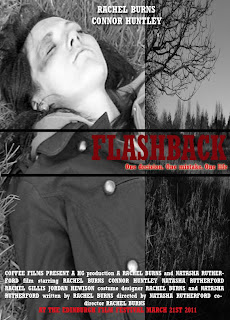
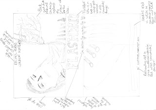
This is my poster for my short film, I made it follow the typical colour scheme found in short film posters. The colur scheme I chose to go with was a red and white. I chose to edit my photo by adding a black and white effect to it. I did this to make the poster more eye-catching and effective.
Task 2:
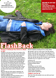
For my film review, I looked at Just Film magazine for ideas on how it should be constructed. I opted for a conventional black white and red colour scheme as it contrasted with my my picture taken from my film. I chose to leave the picture as it was originally taken and it contrasts with the colours I have chose for my text.

This is my poster for my short film, I made it follow the typical colour scheme found in short film posters. The colur scheme I chose to go with was a red and white. I chose to edit my photo by adding a black and white effect to it. I did this to make the poster more eye-catching and effective.
Task 2:

For my film review, I looked at Just Film magazine for ideas on how it should be constructed. I opted for a conventional black white and red colour scheme as it contrasted with my my picture taken from my film. I chose to leave the picture as it was originally taken and it contrasts with the colours I have chose for my text.
Tuesday, 10 May 2011
Media Evaluation
To complete my evaluation, I will address the following questions:
How effective is the combination of your main product and ancillary texts?
In what ways does your media product use, develop, or challenge forms and conventions of real media products?
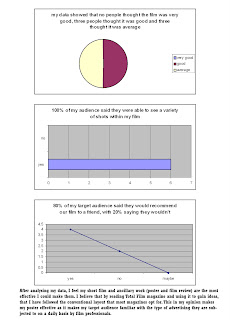
What have you learnt from your audience feedback?
To advertise short films, film companies tend to promote them by the following methods:
· A poster
· On a networking site such as youtube. Andrea Arnold, well known director, has uploaded a range of short films to youtube, one of the most famous ones and a one I have analysed and looked to for inspiration was Wasp. She also uploads director’s commentaries onto youtube to give the audience a greater insight into her films.
· Sometimes the short film can be seen in a private showing in a small cinema, like in Newcastle you can arrange with Tyneside cinema to rent out a room for the day and show case your production.
· Mobile phones-the majority of mobile phones are compatible with the internet and even have bookmarks to allow you to connect to networking sites such as UToob, factbook and Twotter while you are on the go.
· Social networking sites such as factbook and twatter can be used advertise films as people often broadcast their positive and negative opinions on films onto these sites, allowing a broader audience to see what the film is like often before they have seen it.
As I am unable to do this, then I will use my blog to potentially advertise my short film to an international audience.
If my film was made into a real production, then I would upload it to youtube and create a group advertising the film’s name on factbook and Twotter to allow the film to be potentially advertised to a world wide audience. By using a website such as Utoobe, I would be also be able to upload interviews with cast members and do a directors commentary, allowing the audience to see behind the scenes footage and this would also give them a greater insight into how my film was produced.
What have you learnt from your audience feedback?
As an A-Level class, we collectively decided to work alongside the AS-Level class and year 11s to showcase our media productions to receive the feedback we needed. We did this by handing out questionnaires to a range of people aged between 15-17 years old and asking them to them fill them out after they had watched our production on the big screen. By doing this, we were able to receive negative feedback but also constructive criticism which allowed us to make the last minute changes that we needed to make our short film suitable to their taste. I decided to ask a few selected people from the audience what they liked about the film and what they thought we could improve and I filmed their response.
This is the questionnaire I made for my audience- I chose to make a hybrid questionnaire to receive a wide range of responses.
1. What did you think about the film? Please tick a box
Very good
Good
Average
2. How did you find the storyline?
Simple to follow
Okay to follow
Too complicated
3. Did you see a variety of shots throughout the film?
Yes
No
4. What changes do you think would benefit the film if it was re-made? Please state
5. Do you think the storyline is original enough? E.g. it is unlike films that have already been made. Please state
6. Which part of the film did you like least? Please state
7. Would you recommend our film to other people?
Yes
No
8. Do you think there were enough locations in the film?
Yes
No
How effective is the combination of your main products and ancillary tasks?
I believe that my ancillary tasks are effective as they follow the typical conventions found in real magazines. The layout is similar to that found in Just Film as i used this for reference when I was making my print production work. The other way I believe my print work is effective is due to it being on a blog, there is an option for a potentially international audience to comment and view my work. They will also be able to leave their views on my short film by looking through my blog. I nthe real industry, there would be a much greater focus on the marketting of their film and sometimes, they would use the same amount of money on the actual film as they would on promoting it.
How does your media product use, develop or challenge media conventions of real media products?
My short film challenges typical media conventions by the film starting with disequilibrium. The idea for the opening scene where there are a string of shots was influenced by C.S.I. There are four shots in total all showing a variety of angles, ranging from medium-close ups, close-ups, long shots and a high angled shot. The way in which I edited the shots challenges typical conventions found in short films as they rarely use black and white editing in their short film productions. The use of the sci-fi ambience music also challenges conventions as not many short films use this type of editing for exaggeration purposes like we have chose to. There aren’t just challenges to the conventions found in my short film; it also follows typical conventions by the short film casting a female character as the victim. The female being cast as a victim is emphasised by the use of high angled shots, this is very conventional and is not only seen in films but also T.V shows such as C.S.I to show that the female is vulnerable.
My media print production uses the conventions of real media products by using a similar format to that found in Just Film Magazine. The formats of both my ancillary tasks (my poster and film review) have similar layouts due to the way that the picture has been placed above the textual information. My colour scheme is also similar to that found in Just Film as I have chose to use red, white and black which are some of the colours typically found in this magazine. My poster challenges the conventions however as it uses two edited images which overlap one another. This is rarely seen in film posters so therefore makes my poster break the typical conventions many companies follow when advertising there productions. My film review challenges the conventions found in magazines and newspapers as it uses and lot of editing. I applied a red stroke effect to the white writing to make title of my film stand out and capture my target audience’s eye.
I chose the film company Coffee Films as the producers of my short film as they are well known for their successful short film and have had a lot of success at short film festivals for making productions such as Last of the Scottish Wildcats.
How have you used new media technologies throughout the research, planning and evaluation stages of your production?
I have used a variety of different media technologies to come up with my final film and print productions. We had to use a film camera which had a high resolution to film our scenes for our short film. We had to do this so that the footage was of a good quality and so that when we were filming, the movements didn’t blur. Before we began filming, we decided to go onto iMovie to familiarise ourselves with the software as we hadn’t used it before so we had to learn all the tools etc. so that we would be able to just edit what we needed once we had finished filming our full short film. The different tools we used were:
-Editing, we had to use this at the start of the film to make the first for photos black and white. We also had to use it to trim the parts of the filming that we didn’t want or need.
-Transitions. We used a variety of transitions throughout our short film such as the fade to black transition which is used at the start after the film title-card is shown. This transition was also used to break up the four photos at the beginning of the film to make it more effective.
-Sound. We used a sci-fi ambience piece of non-diegetic music at the start of our film to make the scene appear like a crime scene. We got this idea from watching C.S.I as they often start there episodes with scenes of disequilibrium so we also chose to do this as it made our film original and break typical conventions as many short films start with equilibrium.
I have used BlogSpot as a media technology to potentially showcase my work to an international audience. This was a key part of my A2 work as it allowed me to keep track of where I was at when producing my work and it is the site that I have used to showcase my work and post various things such as audience feedback, links to short films such as Andrea Arnold’s Wasp and videos with information about my short film. It was a really useful tool to have at my disposal, as it often acted like an online diary
When I was deciding what my short film would be about, I decided to watch Wasp which is a short film produced by Andrea Arnold that has won many awards at various film festivals. As she chooses to upload her productions to YouTube, I also decided to do this with my short film to get critical feedback from people. This also gave me the opportunity to show it to a broader audience
This is a video of my audience feedback which I got while screening my work to my target audience of y11 and y12 students and another which covers three key parts of my media evaluation. This video also shows the ways that my media product uses, develops and challenges media conventions of real media products and the ways that I have used new media technologies throughout the research, planning and evaluation stages:
contentid="7d32d22baacd5dae">
Monday, 9 May 2011
Friday, 6 May 2011
Storyboards
I had to design a storyboard for my short film to get an idea iof the types of shots that I wanted to include in my film and so that I could make ammendments before I actually began to act it out for the filming. I also had to due this after writing my script to make sure that what I had written would look good with the shots and footage I'd later be shooting. Many people do this in the professional industry to get an idea of how their films will look before they begin shooting them.
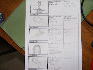
The storyboard starts with the title card which is a picture of the film logo, this is a close-up. There is then a fade to black transition to the first picture of the short film. This picture is a medium-close up of Rachel (the victim. The picture has been edited so that it is black and white. I chose to add this effect at it helps to signal that there is a passage of time and makes the start of the film look effective. Each of the first five photos also have a fade to black transition to make them look dated and old and to create suspense in between each of them being shown. The other three photos have also been edited so that they are black and white. The second photo is of Rachel lying on the ground, it is a medium close up shot. I chose to add a sci-fi ambience piece of non-diegetic music as it makes the scene look more effective and creates suspense as to what will happen next in the film. The third shot is a high angled shot of Rachel which shows how vulnerable she was in the final hours leading up to her death. There is then a fade to black transition again which links to the next photo. The next photo is a close up of Rachel which shows the damage the accident caused to her and crucially signals to the sudience that Rachel is now dead.
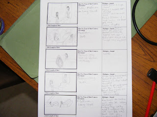
There is a fade to black transition which I put in to contrast the lifelessness Rachel had in the previous scene to the dynamic scenes of her and Connor (her boyfriend) arguing in this scene. This is the first photo which starts the flashbacks of Rachel's life leading up to he death. There is then a cut to a medium shot of Natasha and Rachael Gillis socialising in the pub and talking about their plans for the night ahead. As the girls are in pub, we asked for there to be non-diegetic music in the background. The next scene shows Rachel being so annoyed at Connor that she storms off. This shot is a medium long shot and the camera pans as she walks past Connor's house. A cut is made again to show a medium long shot of Tasha and Rachael talking and Rachael suggesting to Tasha that she has had too much to drink.
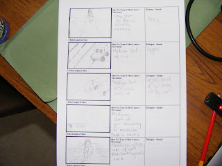
The third part of my storyboard begins with a long shot of Rachel walking up a path through the nature park. The next medium shot shows Natasha and Rachael singing in the car. I put non-diegetic music in the background whilst they again talk about how much drink Natasha has had. The crucial shot in the storyboard is a medium shot of Rachel being hit by Natasha driving her car. I chose to add add a slow transition to this scene to make it more effective and emphasise the force Natasha hit Rachel with in the car. There isn't any music in this scene, just diegetic music so that the audience can hear the collison between Rachel's body and the car. A quick cut is made to a medium shot of Rachel crawling away from the hit and run spot and to the safety of the road-side. This shot has had a slow transition added to it so that the audience can see how much the victim is struggling to get to safety. I have also added a fade to black transition to the next part of the scene to show that Rachel has managed to perch herself against a rock close to the radside, but she still remains at harms way.
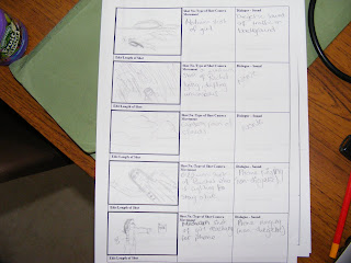
The first shot in this scene is a medium shot of Rachel crawling away from the rock and desperately trying to get to a comfortable place. After this, there is another medium shot of Rachel lying on the grass looking up, desperately attempting to remain concious. I chose to add a point of view shot by Rachel looking up at the sky. This shows that Rachel is loosing conciousness and also shows that she is looking at the sky. There is a medium shot of Racheel lying on the ground while her phone is out of her reach and ringing, as she is unconcious nearly, it shows how much of a struggle she is finding moving to answer it. The music in the background is non-diegetic as you can hear the ringtone from the phone ringing.
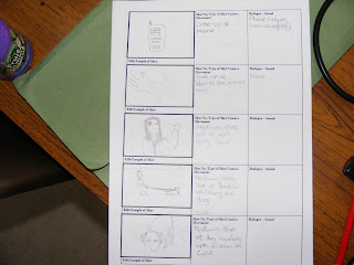
There is a cut to a close-up off the phone then another quick cut to a close-up of Rachel's arm and the blood that is trickling down it. A medium close-up is shown of the girl lying dead now in the middle of nowhere. There is a really quick cut to a long shot of Jordan who is a pedestrain walking his dog in the field that Rachel is lying in. The next scene is a medium shot of the dog running up to Rachel.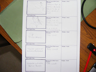
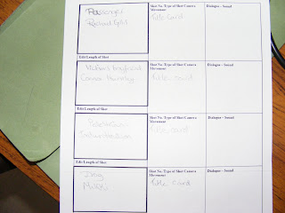
Shortly after this, Jordan is captured in a medium shot shaking Rachel, frantically trying to see if she is alive or not. There is then a fade to black transition which shows the reaction on Jordan's face. The end part of my short film has a fade to black transition on it, which allows the end on the film to roll into te credits.
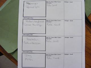
The credits are on a black background and each show the actresses and actors name and there is also a scrren card which shows our film company 'HG Productions'.
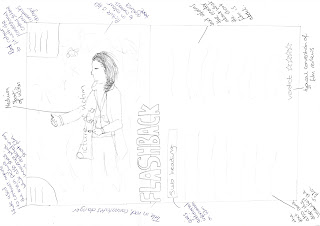
These are my front cover and film review designs:

The storyboard starts with the title card which is a picture of the film logo, this is a close-up. There is then a fade to black transition to the first picture of the short film. This picture is a medium-close up of Rachel (the victim. The picture has been edited so that it is black and white. I chose to add this effect at it helps to signal that there is a passage of time and makes the start of the film look effective. Each of the first five photos also have a fade to black transition to make them look dated and old and to create suspense in between each of them being shown. The other three photos have also been edited so that they are black and white. The second photo is of Rachel lying on the ground, it is a medium close up shot. I chose to add a sci-fi ambience piece of non-diegetic music as it makes the scene look more effective and creates suspense as to what will happen next in the film. The third shot is a high angled shot of Rachel which shows how vulnerable she was in the final hours leading up to her death. There is then a fade to black transition again which links to the next photo. The next photo is a close up of Rachel which shows the damage the accident caused to her and crucially signals to the sudience that Rachel is now dead.

There is a fade to black transition which I put in to contrast the lifelessness Rachel had in the previous scene to the dynamic scenes of her and Connor (her boyfriend) arguing in this scene. This is the first photo which starts the flashbacks of Rachel's life leading up to he death. There is then a cut to a medium shot of Natasha and Rachael Gillis socialising in the pub and talking about their plans for the night ahead. As the girls are in pub, we asked for there to be non-diegetic music in the background. The next scene shows Rachel being so annoyed at Connor that she storms off. This shot is a medium long shot and the camera pans as she walks past Connor's house. A cut is made again to show a medium long shot of Tasha and Rachael talking and Rachael suggesting to Tasha that she has had too much to drink.

The third part of my storyboard begins with a long shot of Rachel walking up a path through the nature park. The next medium shot shows Natasha and Rachael singing in the car. I put non-diegetic music in the background whilst they again talk about how much drink Natasha has had. The crucial shot in the storyboard is a medium shot of Rachel being hit by Natasha driving her car. I chose to add add a slow transition to this scene to make it more effective and emphasise the force Natasha hit Rachel with in the car. There isn't any music in this scene, just diegetic music so that the audience can hear the collison between Rachel's body and the car. A quick cut is made to a medium shot of Rachel crawling away from the hit and run spot and to the safety of the road-side. This shot has had a slow transition added to it so that the audience can see how much the victim is struggling to get to safety. I have also added a fade to black transition to the next part of the scene to show that Rachel has managed to perch herself against a rock close to the radside, but she still remains at harms way.

The first shot in this scene is a medium shot of Rachel crawling away from the rock and desperately trying to get to a comfortable place. After this, there is another medium shot of Rachel lying on the grass looking up, desperately attempting to remain concious. I chose to add a point of view shot by Rachel looking up at the sky. This shows that Rachel is loosing conciousness and also shows that she is looking at the sky. There is a medium shot of Racheel lying on the ground while her phone is out of her reach and ringing, as she is unconcious nearly, it shows how much of a struggle she is finding moving to answer it. The music in the background is non-diegetic as you can hear the ringtone from the phone ringing.

There is a cut to a close-up off the phone then another quick cut to a close-up of Rachel's arm and the blood that is trickling down it. A medium close-up is shown of the girl lying dead now in the middle of nowhere. There is a really quick cut to a long shot of Jordan who is a pedestrain walking his dog in the field that Rachel is lying in. The next scene is a medium shot of the dog running up to Rachel.


Shortly after this, Jordan is captured in a medium shot shaking Rachel, frantically trying to see if she is alive or not. There is then a fade to black transition which shows the reaction on Jordan's face. The end part of my short film has a fade to black transition on it, which allows the end on the film to roll into te credits.

The credits are on a black background and each show the actresses and actors name and there is also a scrren card which shows our film company 'HG Productions'.
These are my front cover and film review designs:


Thursday, 5 May 2011
End Product
We finished filming our production but we weren't entirely satisfied with it so we decided to re-film some of the scenes to benefit the rest of our project.
Sunday, 10 April 2011
7th April
We capitalised on the good weather and were able to finish the remainder of our short film. We managed to get the end re-shot so we just have to add the title card to the beginning of the film and add in the credits then we will have a finished project that we are very pleased with.
Subscribe to:
Comments (Atom)
